September 1, 2026
·OpenEphemeris Team
Real Interactive Charts Inside Claude: How MCP UI Apps Work
OpenEphemeris ships clickable chart widgets that render inline inside Claude — not JSON text. What MCP UI apps are, how they work, and where they do not run.
Most MCP tools work the same way. The model asks a question, the server answers with structured data, and the model turns that data into a sentence. Ask for Jupiter's position and you get back a longitude, a sign, a house number — a description of a chart that exists only in the model's head.
A handful of OpenEphemeris tools don't work that way. Ask Claude for a natal chart and it doesn't just describe one — it renders one. A chart wheel appears in the conversation, drawn from your exact birth data, with a zoom control, a house-system toggle, and planets you can click for an interpretation. Ask for the current moon phase and a live dial appears with an illumination percentage, a void-of-course flag, and a button that asks Claude what void-of-course actually means.
That is not a picture Claude generated. It's a small web app — HTML, CSS, and JavaScript, sandboxed in an iframe — running inside the conversation and wired to the same calculation engine that answers the plain-JSON version of the question. We touched on this briefly in OpenEphemeris Is Now Available as a Claude Connector; this post is about the capability itself: what it is, how it's built, and — because this is the part people assume too broadly — which clients can actually show it to you.
What "MCP UI" Actually Means
A normal MCP tool call returns text and structured JSON. That's the whole contract: the server computes, the model reads the result, the model writes a sentence. MCP Apps extends that contract with one more piece — a tool can also point at a ui:// resource, a small HTML bundle the host is invited to render next to the model's answer. Point a client at it and the same tool call carries two payloads: the JSON the model reads, and an app the human can look at and touch.
The JSON never goes away — which means a client that has no idea what ui:// means just ignores it and behaves exactly like it always has. Nothing breaks for tools that don't render.
The app isn't decorative, either. Click a planet on the OpenEphemeris chart wheel and nothing appears in the chat yet — the iframe quietly hands Claude a private note about what you just selected, priming its context for later. A small "Ask Claude" button surfaces next to that selection; tap it, and the iframe posts a real message into the conversation on your behalf — "Interpret Saturn in the 7th house, applying square to Venus" — the same way anything you type yourself would. Claude reads it and answers live. The prose you get back is genuinely Claude's own, generated fresh from the data you pointed at, not a canned blurb pulled from a lookup table.
A Walkthrough, in Four Charts
OpenEphemeris exposes nine of these explore_* tools, rendering seven distinct chart apps. Four of them, below, with what they actually look like — not a mockup, the real widget.
explore_natal_chart — the chart wheel
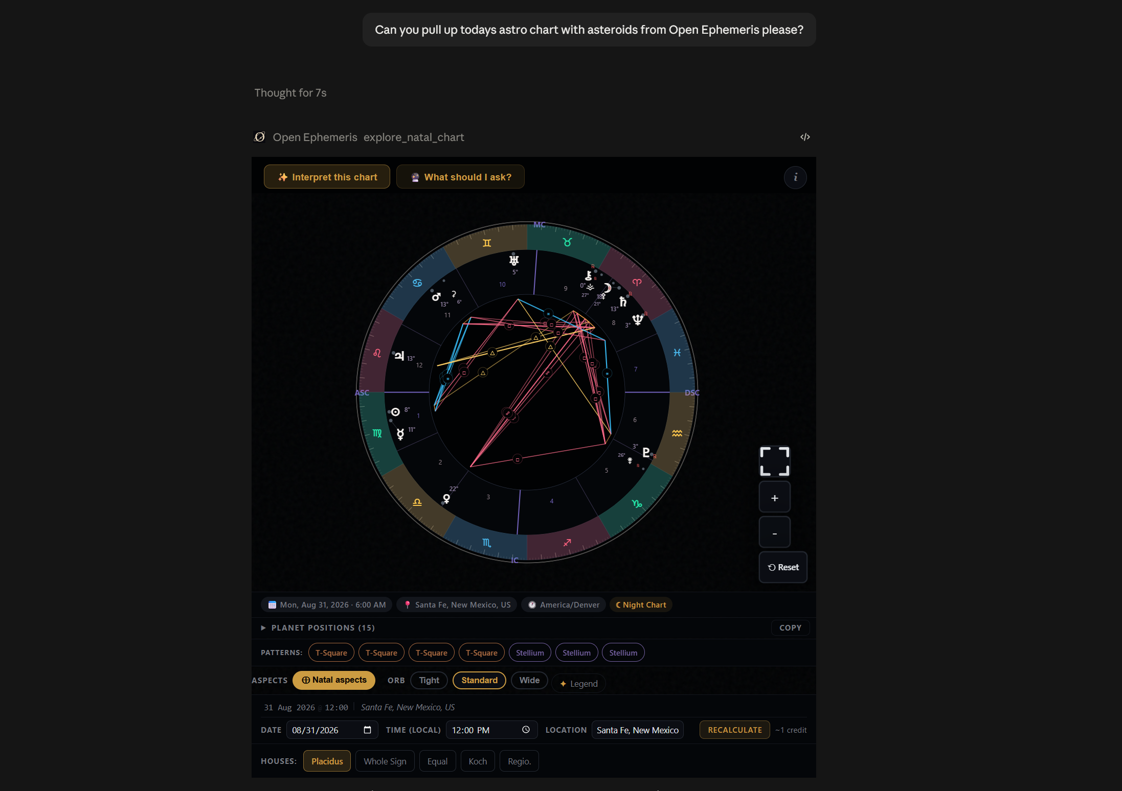
Ask for a chart and this is what comes back: a full radial wheel with aspect lines colored by type, house cusps, and a data strip identifying the birth date, location, timezone, and whether it's a day or night chart. Below the wheel, OpenEphemeris auto-detects and badges the patterns it found — a T-square, a stellium — the kind of thing you'd otherwise have to eyeball. A collapsible planet-position table sits underneath with a one-click copy button, for when you want the raw degrees rather than the picture of them.
The controls aren't uniformly cosmetic or uniformly live, and that distinction is worth knowing. Switching the house system — Placidus, Whole Sign, Equal, Koch, Regiomontanus — fires a real recalculation against the DE440 ephemeris, because house cusps depend on the system chosen. So does changing the date, time, or location and hitting Recalculate, for a fee of one credit shown right next to the button before you commit to it. The orb toggle (Tight, Standard, Wide) is the one exception: it re-filters the aspect lines already returned in that same call, entirely in the browser, no server round-trip and no charge. Clicking a planet, house, or aspect line selects it and quietly primes Claude's context — nothing appears in the chat yet. An "Ask Claude" button surfaces next to the selection; tap that and Claude writes a live interpretation of exactly that placement — you're pointing instead of typing "what does my Saturn in the 7th mean," but the answer is Claude's own, generated on the spot, not a pre-written blurb.
explore_vedic_chart — sidereal Jyotish
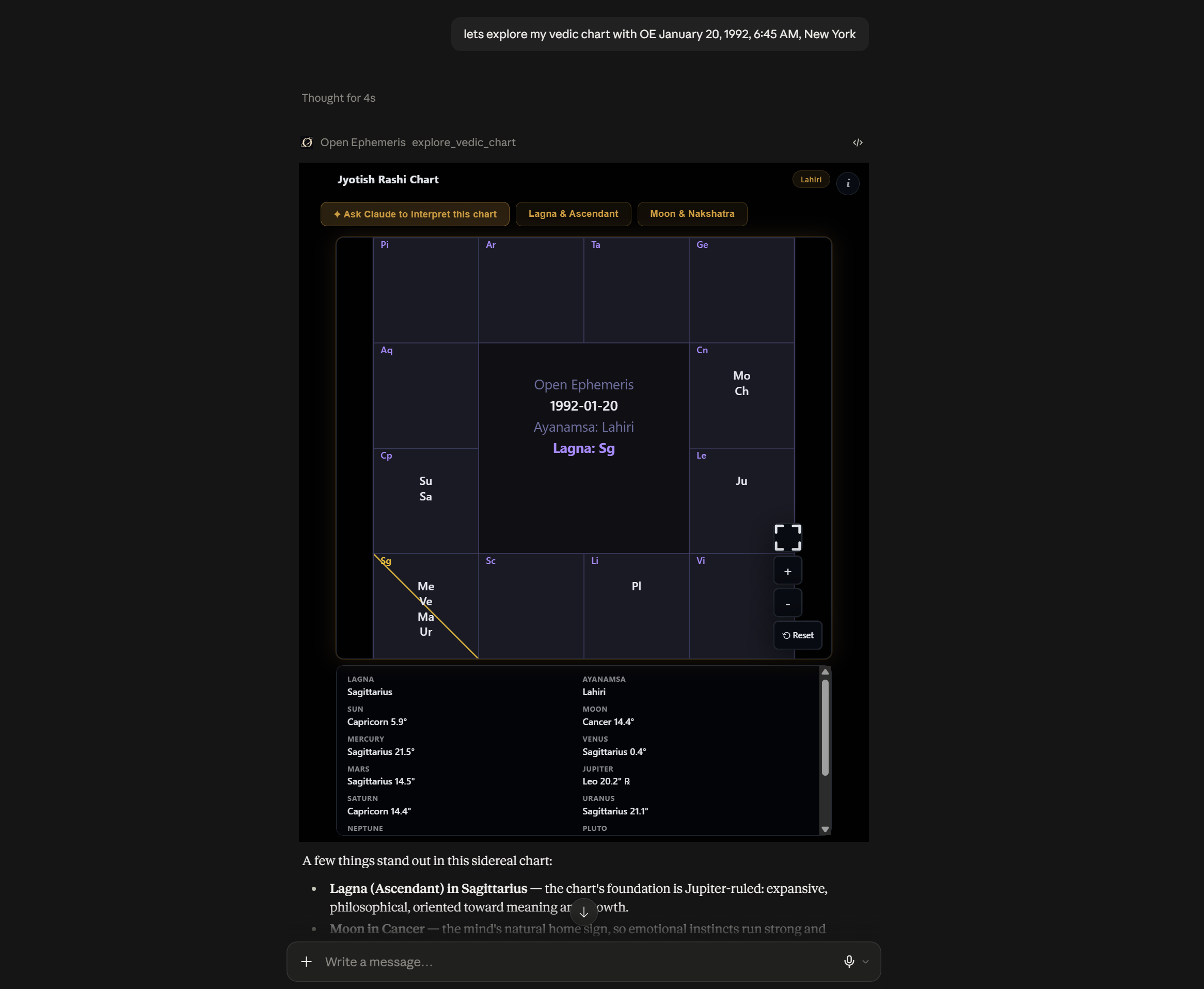
The Vedic version applies the Lahiri ayanamsa by default — a sidereal correction, meaning the zodiac is anchored to the fixed stars rather than the moving equinox — and shows it as a badge in the corner so you know which correction you're reading. The Rashi chart sits above a scrollable data panel listing every planet's sign and degree, Lagna first.
The button row is where this one gets specific: alongside a general "interpret this chart" action are two shortcuts tuned to Vedic practice — Lagna & Ascendant, and Moon & Nakshatra — the two placements a Jyotish reading typically opens with. Neither is a generic label slapped on the same handler; each calls its own interpretation path.
explore_bazi_chart — Four Pillars
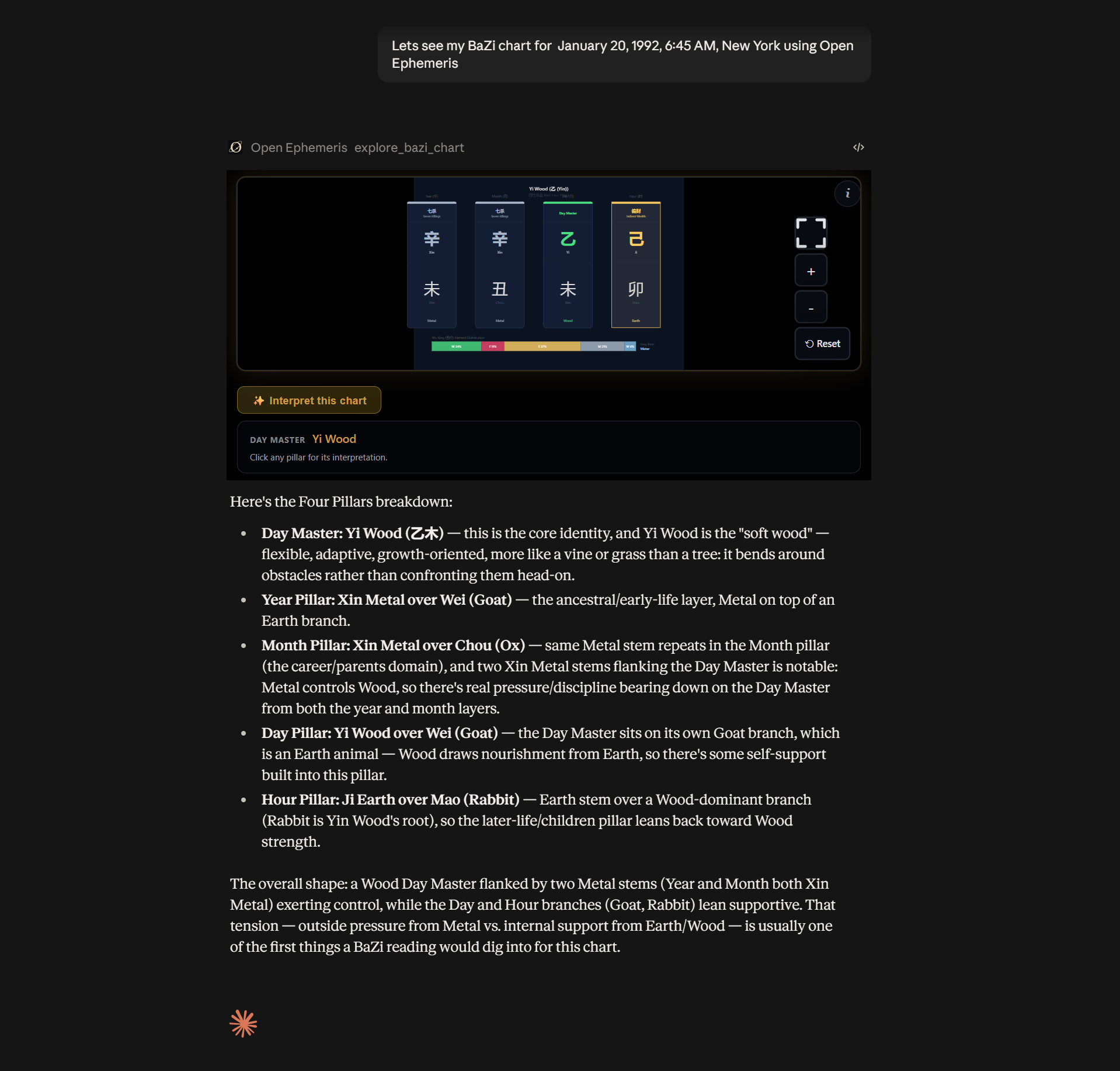
Four Pillars gets its own layout entirely: four stacked columns — Year, Month, Day, Hour — each showing a heavenly stem and earthly branch in their original characters, with the ten-god relationship (Seven Killings, Indirect Wealth, and so on) labeled above each one. A Wu Xing element-distribution bar runs beneath the pillars, showing at a glance whether the chart leans Wood, Fire, Earth, Metal, or Water.
The interaction here is per-pillar rather than per-symbol: click any of the four columns and Claude interprets that pillar specifically, distinct from the single "interpret this chart" button that covers the whole reading. It's a different click model than the natal wheel's planet-by-planet approach, because a Four Pillars chart is read pillar-by-pillar, not point-by-point — the widget follows the tradition it's rendering rather than reusing one interaction pattern everywhere.
explore_moon_phase — the live dial
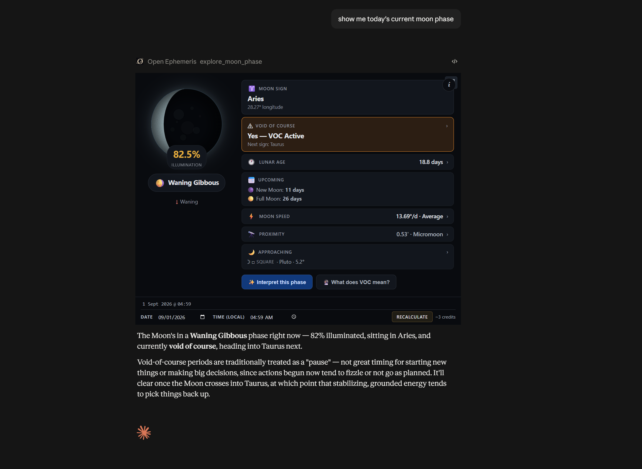
This one trades the chart-wheel format for a dashboard: an illuminated crescent on the left, a stack of readouts on the right. Illumination percentage and phase name (Waning Gibbous, in the screenshot above). Moon sign and exact longitude. A void-of-course flag — voided, meaning the Moon has finished its last major aspect before changing signs and is, by the old rule, a poor window for starting anything new — with the next sign it's headed into. Lunar age in days, a countdown to the next new and full moon, current moon speed against the roughly 13°/day average, and proximity (micromoon or supermoon, depending on where it sits in its elliptical orbit).
A date-and-time control at the bottom lets you ask about any other moment, past or future, with the recalculation cost — three credits, pricier than the other three because it also resolves void-of-course timing — printed on the button itself. Two actions sit below the dial: interpret the current phase, or ask specifically what void-of-course means, for anyone who saw the flag and wanted the definition before the reading.
The Rest of the Set
Those four cover the tools with fresh screenshots, but they're not the whole surface. explore_bi_wheel keeps Person 1's natal chart as a fixed inner ring and layers a second, comparison ring around it — six modes to choose from: a second person's chart (synastry), transiting planets for a date, secondary progressions, a solar or lunar return, or solar arc directions. Cross-aspects between the two rings draw as dashed lines you can click, same as the single-wheel version. explore_transit_timeline skips the wheel format entirely and lists upcoming transits to a natal chart as a vertical, month-grouped timeline instead — click any hit for a focused interpretation of that one crossing. explore_human_design renders a full bodygraph, with explore_human_design_transit and explore_human_design_connection as its transit and two-person variants. Same pattern throughout: whatever you click, the interpretation that comes back is a live message to Claude built from the data on screen — the widget's job is composing the right question on your behalf, not writing the answer itself — all grounded in the same DE440-calculated positions every other OpenEphemeris endpoint uses.
One thing that isn't in this set: electional astrology — finding a good window for an event — is a real, separate part of the tool catalog (ephemeris_electional, electional_aspect_search, and others), but it returns data only. There's no rendered electional app today; the interactive surface above is charts and timelines, not search results.
Why This Isn't Everywhere
Here's the part worth being precise about: MCP UI is a capability a host chooses to implement, not something every MCP client gets for free by talking to our server. The tool always returns the same ui:// resource pointer — that part of the response never changes based on who's asking. What differs is whether the client on the other end knows what to do with it.
Claude Desktop, the claude.ai connector, and ChatGPT all implement MCP Apps, so the resource resolves into a live iframe you can click. Point Cursor, Windsurf, or any other MCP-compatible client at the exact same server, and you get the exact same nine tools, computed from the exact same ephemeris data — just without the rendering step. Those clients fall back to a static SVG image of the chart: accurate, but not clickable, because there's no iframe host on their end to click into.
Nothing about that is a downgrade we chose to apply elsewhere; it's a feature those hosts haven't built yet. If a client ships MCP Apps support tomorrow, these same tools render for it with almost nothing changing on our side — the resource was always there, waiting for a host willing to read it.
Updated 4 September 2026: that turned out to be a short wait. ChatGPT renders these same widgets now, from the same single build — no forked implementation. Supporting it took a handful of compatibility aliases on the tool metadata; the charts themselves were untouched. The full story is here.
Try It
The fastest way to see this is to ask for it. If OpenEphemeris is already connected to Claude, try: "Show me today's moon phase," or "Explore my natal chart" with a birth date, time, and place. In Claude, the widget shows up in the reply, not a paragraph describing one.